
I love playing games, so let's play one now. Look below at all these different twitter feeds. What do they all have in common?
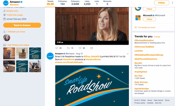
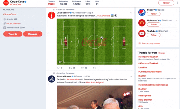
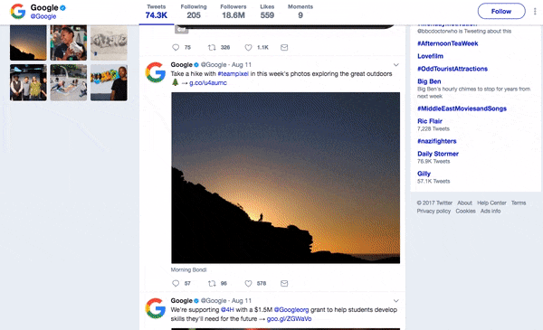
Not one single post is simply text. Every single bit of content on their social media is visual in some way shape or form. It is eye catching, it is engaging, it is fun and exciting. Remember, every single audience member is lazy and impatient. If you can make your post more visual, you’ll see higher engagement rates.
Obviously these companies are huge, and have huge teams dedicated to creating social media content. Every piece of content they produce appears to be completely unique. A hard task for any organisation or business to compete with if resources are thin on the ground.
But there are things you can do that will help you in a resource- tight situation that will allow you to still create content that is visually pleasing and engaging. You could create a range of templates, either static or video, where you can easily change the details within. Ta dahh, new piece of content! A warning when using this trick however, you need to think about what order you send this 'template content' out to the public. Five videos in a row with the same template is going to make your brand or organisation look lazy and uninspiring. Never a good thing....
I am stuck for ideas though!
That’s where we can help you out so don’t worry! There are loads of ideas you can utilise to make your social media more exciting.
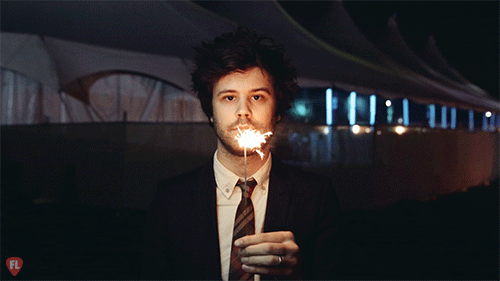
GIFS
GIFS ( a lossless format for image files that supports both animated and static images) are a great way to add quick and easy loopable video content to your social media feed that, when done right, are very good at catching the audiences eye as they scroll through the never ending 'news feed'. At Social Change UK we have started to use GIFS more and more as we saw increased engagement with content attached to a GIF. Why? Because they aren't boring! It isn't just text and it can offer information to the audience quickly and easily without having them expend too much effort to absorb the information. Remember, audiences = lazy.
There are a wide variety of uses for GIFS, so get creative with it!
Why not use them to show off individual statistics? (I wonder what will happen if you clicked that GIF....)

Or why not tell a small story through your GIF to grab the audiences attention? (This GIF is clearly lonely, give it some love, give it a click)

Or use GIFS to show off a particular diagram to tease a bigger piece of content? (Dare you to click on the GIF below!)

Interesting images
This one sounds like common sense, however you would be surprised how many companies use bad images to try and encourage audiences to click through to their content.
First things first though, even if you have the most exciting subject to photograph with the most amazing setting, it doesn't mean anything if you fall into these 4 mistakes. Can you guess what these are doing wrong?
Top left - Lighting is okay but it is blurry, there is nothing more annoying that a blurry image!
Top right - The lighting is really poor when it clearly can be improved.
Bottom left - Keep your camera still when taking a photograph. Motion blur makes it hard to see what is happening in the image. I see so many blurred images on social media everyday. Terrible.
Bottom right - Don't get fancy with the framing unless you have a good reason to do so. In this image, framing right doesn't give the viewer anything exciting to see on the left hand side.
Its all about learning.
Anything to do with photography and/or filmography, it takes practice and discovering what works and what doesn't. At Social Change UK, we are constantly developing our skills and outputting better content, including advertising content.
Have a nosey at all of these campaigns by clicking on the pictures!
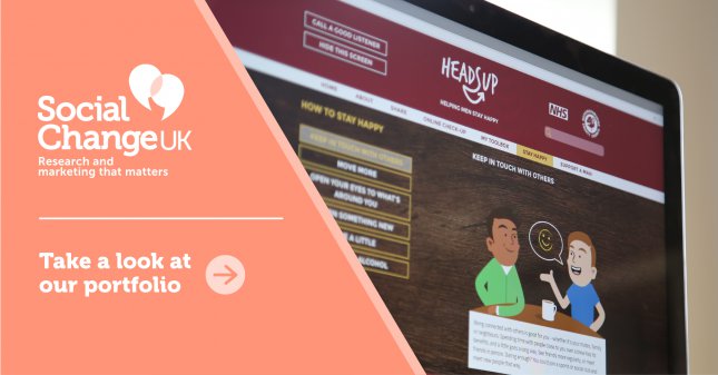
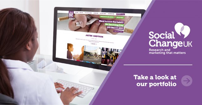
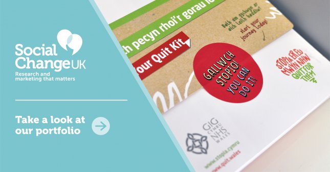
The use of high quality photography, bright colours and a prominent logo, we have found that this sort of content advertising works leaps and bounds better than a simple word post and a link. I have said it before, but it is all about grabbing the audiences attention in about 3 seconds, as this is the time your content will be on someones screen as they scroll through their feed. Make it bright, make it interesting, with a clear call-to-action, and people will be more willing to give your content the time it rightly deserves!
Little Videos
This might sound like an obvious content type to use, however the emphasis has to be on the "little". To maximise your watch rate, you need to create different video lengths for each social media platform. Here are some rough guidelines for you to follow.
Twitter: 10 - 30 seconds in length.
Facebook: 10 - 60 seconds in length.
YouTube: Ideally no longer than 2 minutes, however this platform is a lot more flexible with timings because people go on YouTube specifically to watch video content.
That first second
I feel like I am always banging on about this, but your audiences are lazy and hungry for something interesting to catch their eye, so it is crucial you make that 1st second of your video the most amazing, the most eye catching, the most incredible second ever created in the history of the human race. No big task really (sarcasm). Take a look at the following little videos that we have used in the past.
Think about sound, or lack of it.
When you scroll through any of your social media channels, the videos might autoplay, but there won't be any sound. And many people don't click on to hear the sound. They will watch without hearing a word. Why? Well think about where people might be on social media, they could be in public, without headphones...they might not want to have the sound on in case they annoy the grumpy old lady next to them on the bus. This means you have to make your content work without sound. Think about sound as an unexpected tax return. Nice to have.
Take this little video we created to advertise our Mattering video. It was primarily used on YouTube advertisements, which as a side note, have a harder task of grabbing and maintaining the audiences interest because these are actively stopping the audience from seeing the video content they wanted to watch.
The video jumps straight into it, with bright colours and abstract shapes to make it really striking and eye catching. Thinking of sound, it goes for a non-PC approach by immediately swearing (but bleeped out) to grab the audiences ear. Without the sound it is still obvious that this person is angry by censoring the swearword. It uses twitter posts and emojis that are recognisable and relatable. The large quantity of tweets that speed past the screen create a sense of quantity. Because they are difficult to read at that speed it intrigues the audience (and subtly annoys them) so they are motivated to act on the call-to-action to find out what it is all about.
In this example above, we created little videos to portray information that is way more exciting that just listing out the information in text format. Keep in mind that not every single little bit of content needs to be the most creative, internet-breaking idea ever. Sometimes keeping it simple and straight forward is the best way to go, especially when communicating facts. The last thing you want to do is get the information lost in translation with an over-complicated idea that requires an IQ higher than 110 to figure out.
Saying that, there is a fine line between keeping things simple and insulting the intelligence of your audience.
Cinemagraphs
This is something you might not have heard of, but most likely have seen before in various forms. Put simply, a cinemagraph is a photograph with one piece of the picture looping in movement. You're probably thinking, 'what is the point of that?'
Firstly cinemagraphs are very artistic, offering the audience the opportunity to interpret the blend of still image and movement together. Why is this good? Well, like anything you offer an audience to figure out, a joke, a riddle or a cinemagraph, it makes them feel smart and accomplished when they reach a conclusion, if that be the concrete answer to a joke/riddle, or an interpretive conclusion of a cinemagraph.
Secondly, and most likely more important for marketeers, is it's eye catching. There are times when you are looking at something, then something flickers in the corner of your eye. Instantly, you look at what that flicker is, out of either curiosity or annoyance. This is what a cinemagraph is. A constant 'flicker'. We see a photograph and expect nothing more than a still image, then you have this looping element that is (to some extent) mesmerising to look at because you are basically watching a few seconds of real life on repeat forever, which is nothing but fascinating!

Pretty damn cool, right?
I have thrown a few ideas and examples at you, which can be a little overwhelming, especially when your mind starts going in overdrive with all these ideas. The best thing you can do right now, is start to jot down all these ideas, and see what you think can be developed - thinking about what will work for your business or organisation and importantly what your audience are likely to respond to. Not every idea is going to be golden, so don't get discouraged if you don't hit the jackpot of ideas right away!
If you want a hand with creating something awesome for your social media, we are always here, ready and waiting to help in any way we can. I'm Rob by the way. You can hook up with me on email: Rob@social-change.test or we can try the old fashioned telephone. Give me a call on 01522 775060.