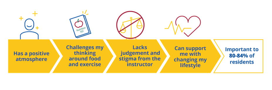
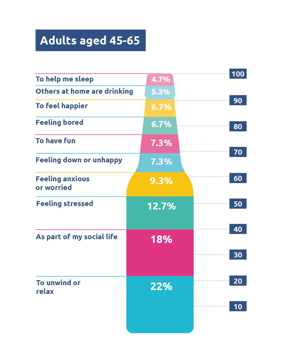
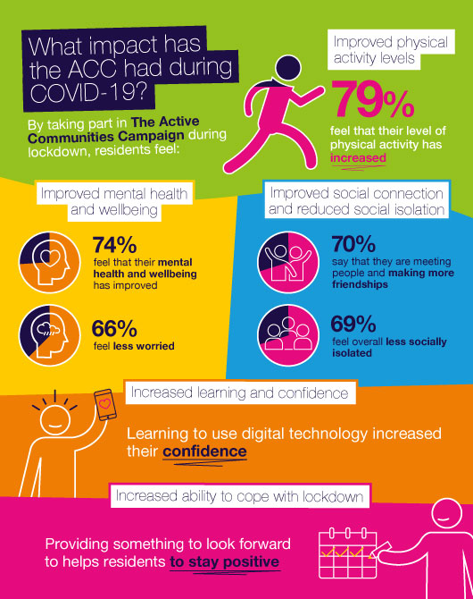
I recently attended the inaugural Nudgestock conference, the world's 'biggest festival of behavioural science and creativity', which unites those with a passion for understanding and positively influencing human behaviour with a day of knowledge-sharing and inspiration.
This year's theme was 'messy', encouraging everybody to embrace the messiness of the human mind and the world that we live and work in. The day covered an interesting array of topics, from the authority gap to the nocturnal brain, but my ultimate favourite had to be Mona Chalabi's 'taking the numb out of numbers', exploring the power of data visualisation in displaying and communicating information. Mona showed the audience a variety of her own data visualisations, ranging from sketches of dogs’ backsides (yes, really!) to represent the most common dog names in America, to simple drawings of arms differing in length to represent the number of female Heads of State different countries have had. These were brilliant examples of how numbers can be transformed into funny, interactive, conversation-starting visuals.
Data visualisation refers to the representation of data using visual formats and tools such as charts, maps, infographics and graphs. These visuals allow you to tell a story of insights contained within numbers and statistics. At Social Change, we are always looking for ways to break the mould with the way we present our research, using creative and engaging methods to communicate, inspire and engage a variety of audiences. The Nudgestock talk did just that for me, showing why data visualisation can be such a powerful tool when it comes to communication, creative marketing and, ultimately, behaviour change.

Visuals to engage
Data that is presented visually taps into the behavioural principle of salience. In other words, people are more likely to be drawn towards a visual depiction of information, such as a story or journey, more so than if it were a table or Excel sheet full of numbers. Visuals that are colourful will stand out and capture people's attention, even more so if they are shocking or perhaps humorous in some way (e.g., the dog backsides example!).
Example: If you want to capture and maintain the attention of your audience, your visualisations need to be attractive and appealing in some way. Making visuals interactive, through animation or use of pathways (e.g., flowcharts) and puzzles that encourage them to reflect and go on a journey to reveal the key message of the data, can be particularly engaging.

Visuals to make information accessible
Data visualisation also provides a more accessible format for digesting information, other than complex datasets and scientific or mathematic language. Often the most powerful visualisations are those that are bold, attractive and engaging (as described above) but also simple, and not overcomplicated. This makes them easier to understand more quickly, reduces the likelihood of alienating audiences with complicated jargon, and instead portrays something that can be understood or connect people more universally.
Example: If you’re wanting your audience to make connections between data points without overloading them with complex written or numerical information, consider positioning visual representations of data points that are related close to one another. Similarly, if you represent related elements of a visual by using the same colour or shape, people are able to comprehend connections between them with very little cognitive effort required.

Visuals to evoke emotion
Whether it's a graph displaying hotspots of crime, or the number of rapes that lead to a successful conviction of a perpetrator (highlighting the stark reality of the large number that don't), visualising data in evocative ways, can not only tell a deeply emotive story, but leave a lasting impact on people and influence their future behaviour. Stories convey meaning, and meaning resonates with, and connects people.
Example: Let’s say you’re wanting to visually represent homelessness rates in the UK and convey the harsh realities that those without a place to call home are facing. To provoke emotions such as empathy, you could draw upon Colour Theory which would point you towards cool and calming colours like blue. Using more ‘playful’ fonts with soft edges and using symbols or visual images to represent key data (e.g., a sleeping bag) can further reinforce a friendly and empathetic tone to strengthen the connection the audience feels in relation to the population being represented.
If you want to learn more about how you can start getting visual in your representation and communication of data, check out this article for ten of the best data visualisation blogs (excluding this one, of course...) out there!

