
Hello January! The Christmas excess has taken its’ toll and if you’re anything like me you’ve imbibed and consumed non-stop for the last month. Time for a reboot, do some exercise and start to eat healthily.
However, sticking to our goals is hard and there are many situations where temptation tests our resolve. For people watching what they eat one challenge is eating at a restaurant or ordering a take away.
For this blog we are focusing on menu design - showing how the design and layout influences what you order and how small adjustments could go some way to supporting those trying to eat healthily.
This is an issue which is both topical nationally and important for our work here at Social Change UK.
Nationally obesity rates in the UK have been identified as a challenge and are rarely out of the news or the target of a new health campaign.
At Social Change UK menu design and healthy eating is something we know well. We are currently helping restaurants meet legal requirements to list allergy information on their menus through Menulab, and we would like to develop this service further to provide timely, well designed and effective nutritional information for diners as well. We have also won awards for previous projects with restaurants and takeaways in the Midlands that we will touch on later.
To add to our knowledge we conducted a pilot eye tracking project to understand in detail how people view menus. We gave 27 students 6 pizza menus and asked them to choose a restaurant and order a meal. There are links to a few clips we’ve put together from this research. If you’re interested in more of the insight from this study get in touch and we’d be happy to share more with you.
Menus provide a prime example and application of choice architecture. This phrase was coined by Richard Thaler and Cass Sunstein in their book ‘Nudge’ and captures the fact that how information or a choice is presented influences both the decision process and the final outcome. We’ve highlighted a few elements which nudge diners a certain way in terms of what they order. We’ve also done a bit of blue sky thinking about how these effects might be applied to support healthy eating and potentially benefit restaurants as well.
CHOOSING A RESTAURANT
You can’t judge a book by its cover – but with restaurants and take-aways often the menu is the only way you can judge a restaurant or make a choice. This decision is normally made quickly and intuitively, a good example of a System 1 decision, so the imagery and text is important. It’s also interesting to note our physiological state has a bearing on how we choose.
The heatmaps below are taken from our study and show the difference between where hungry and satiated students look when choosing where to eat.
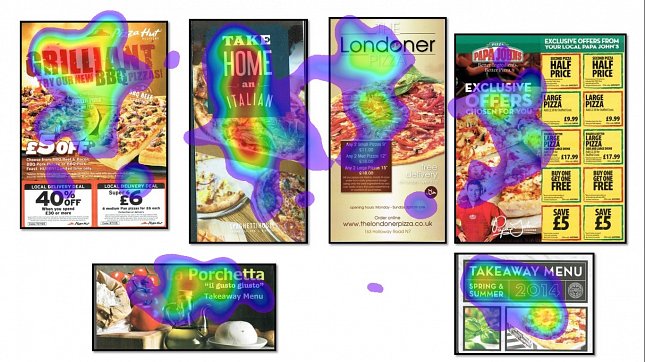
As you can see the hungry students (defined by a self-report Likert scale) looked at the images of pizza more than the satiated students. They also fixated faster on the images of pizza than the full students. Hardly a surprise you say – we’re more drawn to look at tempting food when we’re hungry. Right but not only did they look at these menus they were also more likely to choose them to order from.
Watching what we eat, involves a degree of willpower and self-control, often we have to over-ride temptation which can be especially hard when at the start of a diet.
This susceptibility to hedonic food imagery is one of the prime reasons late night fast food restaurants have succulent or highly tempting images on display. Firstly, as shown, the images draw the attention of people who are hungry and secondly after pubs shut, people tend to have less self-inhibition and as result will be more susceptible to food cravings. This may also factor in to moves in the UK to reduce the number of fast food establishments located close to schools - one assumption being that children maybe more susceptible to these images as well as needing to develop self-control.
So what could be done about resisting these temptations – especially whilst hungry? There’s not a simple solution to this but being creative and supporting both diners as well as the business needs of restaurants is important.
One intervention we pioneered in Lincoln did just this - working with chefs in the kitchens as well as with diners and restaurant owners. Working with the chefs we helped them substitute fattier ingredients for healthier ingredients, for example replacing ghee with cooking oil, reducing the calorie intake and cost whilst maintaining the taste. At the same time we raised awareness through PR of restaurants taking part in the healthy initiative in the local press. One of the key elements of this project was having restaurants place a sticker in their window saying they were participating in this initiative and serving 'healthier food'.
For those diners who were aware of the initiative and who were watching their weight at the same time – this served two key purposes. Firstly it highlighted that these restaurants were both providing healthy food options to meet their needs. Secondly it served as a reminder or prime to diners to stick to their weight loss goals and commitments. This subset of diners then were more likely to frequent those restaurants displaying the stickers – winning business for the restaurants.
This has been proved academically - that subtly reminding a diner of their commitment to healthy eating can re-enforce them of their weight loss goals and reduce calorie intake.
We illustrated this in our eye tracking study as well. As part of a series of questions capturing demographic information we asked students, ‘Do you watch what you eat?’. For half of the students we asked them before choosing their meal, for the other half we asked them after. The theory being reminding or priming students who watched what they ate of their self-concept (as a dieter) before they chose their menu and meal would influence their choice.
Consistent with the theory - those who said they watched what they ate and who were asked before selected a higher amount of the perceived healthy menus, versus those who were only asked afterwards.
But we can’t be present to ask or remind people verbally about their health commitments when they’re out and about – is there another way of doing this?
In our small project one of the menus had a small symbol in Arabic which signified the food was Halal. For non-Muslims this symbol was irrelevant and not noticed, however for the Muslims in the group this was extremely salient. It captured their attention early and influenced their choice.
This concept could also be applied to healthy eating, or healthy options on a menu – similar to the sticker in the window in our Lincoln project. By having a universal symbol or sign for healthy food – for those diners looking to watch their weight it could support them. Firstly it would show that the restaurant caters for health conscious eaters by providing dishes that suit their life choices. From a restaurants perspective this could win business.
Secondly as mentioned it would provide a subtle reinforcement of their commitment to healthy behaviour. Weight watchers do this for food or ready meals in a supermarket, by partnering with food providers and allowing them to use their logo. Could there be a possibility of extending that or developing a symbol without compromising the sense of reward people get from eating out or ordering a take away?
Choosing a restaurant
After you’ve chosen which restaurant to order from there are multiple ways restaurants influence what and how much you order through the design of the food options.
By bundling items together into meal deals this increases diners ordering these things – often supersizing drinks and sides as well. This achieves a number of things. Firstly it means people order more food from the restaurant – this generally equates to spending more money so more profit. Secondly diners perceive that through the deal they are getting value for money, in part this is linked with anchoring effect of the a la carte menu prices (discussed below). Lastly a meal deal makes it hard for diners to calculate the explicit value of an item on the menu – which in a way makes it harder to complain about the size of a portion as people don’t have an explicit price for each item.
Looking through a health lens is there an opportunity to provide healthier or lite meal deals? This would assist the diner and could also provide a higher margin for the restaurant, as ingredients for healthier foods often are cheaper to source.
The way a dish of food is described also influences the uptake. A ‘succulent Plaice with green beans’ versus ‘Plaice with green beans’ increases diners choosing the dish by almost a quarter. Using words such as ‘light bites’ as opposed to ‘healthy bites’ also increases ordering from that section.
As mentioned before, a fundamental tool of menu design is the use of a price anchor which is placed prominently in one of the corners of the menu or highlighted with an image or a box. This anchor could be a high priced item such as a prime steak. Although it’s unlikely you will order the item it will be one of the first things that you process - it therefore gives you a reference point or ‘anchor’ of a high price. This means any item you view subsequently will seem relatively better value.
To encourage healthy options potentially providing a healthy option in one of the prime positions adjacent to an anchor on the menu would benefit uptake. This would provide a subtle queue or prime to encourage people to eat healthily – and may make the dish appear more reasonable or appealing.
CALORIE INFORMATION – the pros and cons.
In the US in 2010 Calorie information was made mandatory in chain restaurants. However simply providing Calorie counts doesn’t necessarily lead to healthier eating. However, it does lead to more informed decision making.
George Lowenstein and his team have researched how calorie information in different formats influenced consumer choice. It was shown that simply presenting calorie information didn’t influence how people chose food at restaurants or had a very small effect. Other ways of presenting this information appeared to influence diner’s decisions to a greater degree.
For example using a colour coding or image based system for showing unhealthy choices appeared to work better than simply providing the calorie counts. There was also research exploring the effectiveness of presenting calories: as a % of daily recommendation; as a % of snack calories; as time taken on the treadmill to burn the calories; using a traffic light system; using icons to represent body size and finally using letters ranging from A-F. From this research the most effective displays appeared to be showing the calories as a % of daily allowance, or the traffic light system.
Additional studies have shown that diners tended to order food from items listed at the top and bottom of the menus – and also that ordering a menu in terms of calorie count meant the calorie count was used more by the diners. This ordering effect is a prime example of choice architecture and the fact that how information is displayed is crucial to achieving behaviours or decisions that are desired.
There are multiple ways restaurants can influence what diners order from a menu - from the imagery on the front through to design and layout of the food options – many more than we’ve touched on here. Although we wouldn’t advocate a dictatorial approach to menu design, we do believe support and subtle cues for diners looking for a healthier options could be included to guide people around a menu – and can be beneficial from a business sense to restaurant owners as well.
If you’re interested in more detailed insight into the process of how diners order food, or how we’re applying some of this insight across restaurants and catering then we’d love to hear from you.